

Initial Thoughts on the PSA Magazine Slab

This week, I received my first graded magazine submission back from PSA. After nearly throwing my back out carrying the package, I put together some initial thoughts on the slabs themselves:
Packaging
It seems PSA does not want to deal with reholder requests for damaged slabs. These things were so well-protected during shipping you’d have thought they were sending me the nuclear football. Each slab is separated by packing paper and secured by purpose-made foam packaging end caps.
I don’t want to jinx future orders, but it seems very unlikely any PSA slabs could be damaged during shipment.
Slab Size and Weight
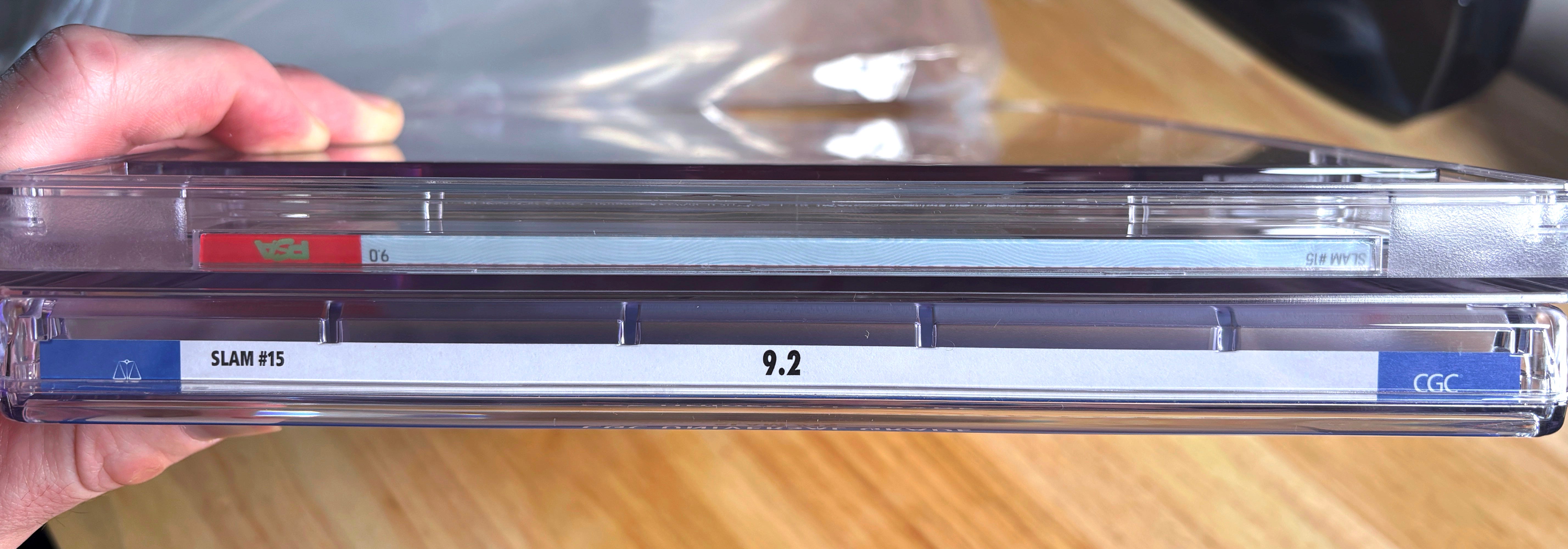
As anyone who has held both immediately noticed, PSA’s slabs are heavier and sturdier than CGC’s. The plastic is also clearer, with no blue tint. For card collectors, I would compare the PSA magazine slab to a One Touch and a CGC slab to a top loader. These are premium holders in both rigidity and clarity.
The slabs are about a half-inch taller than CGC’s from top to bottom, which means the Superior Fit sleeves made for CGC slabs don’t seal, and Casematix’s velcro storage boxes don’t close. Hopefully both companies come out with new storage accessories to accommodate PSA’s products. (Update: Superior Fit now has sleeves available for PSA magazine slabs!)
The weight becomes an issue when transporting large quantities. By my calculations*, the PSA slab weighs 12.8 oz. more than CGC’s, or about three-quarters of a pound. A box of 20 PSA slabs weighs at least 15 pounds more than the same mags in CGC slabs. If you’re setting up a full table of graded magazines at a card show, you might be transporting an additional 90-120 pounds of slabs from the car.
*For this test, I used three copies of SLAM #15 — one ungraded, one in a CGC slab, and one in PSA. The raw issue weighed 8.0 oz., the CGC slab 29.5 oz., and PSA 41.8 oz. A box of 20 PSA-graded issues of SLAM #15 would weigh more than 52 pounds!
The Love/Hate Label
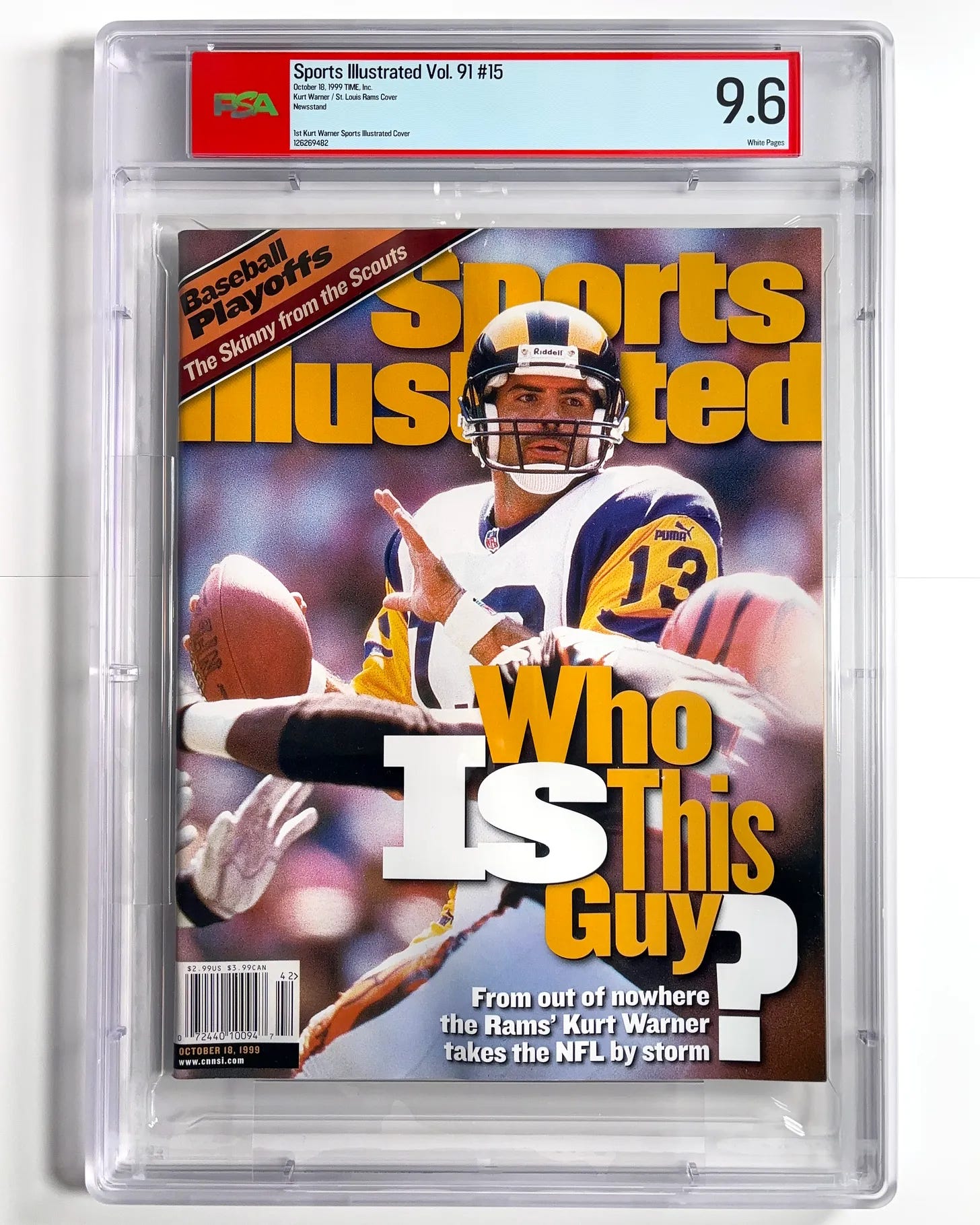
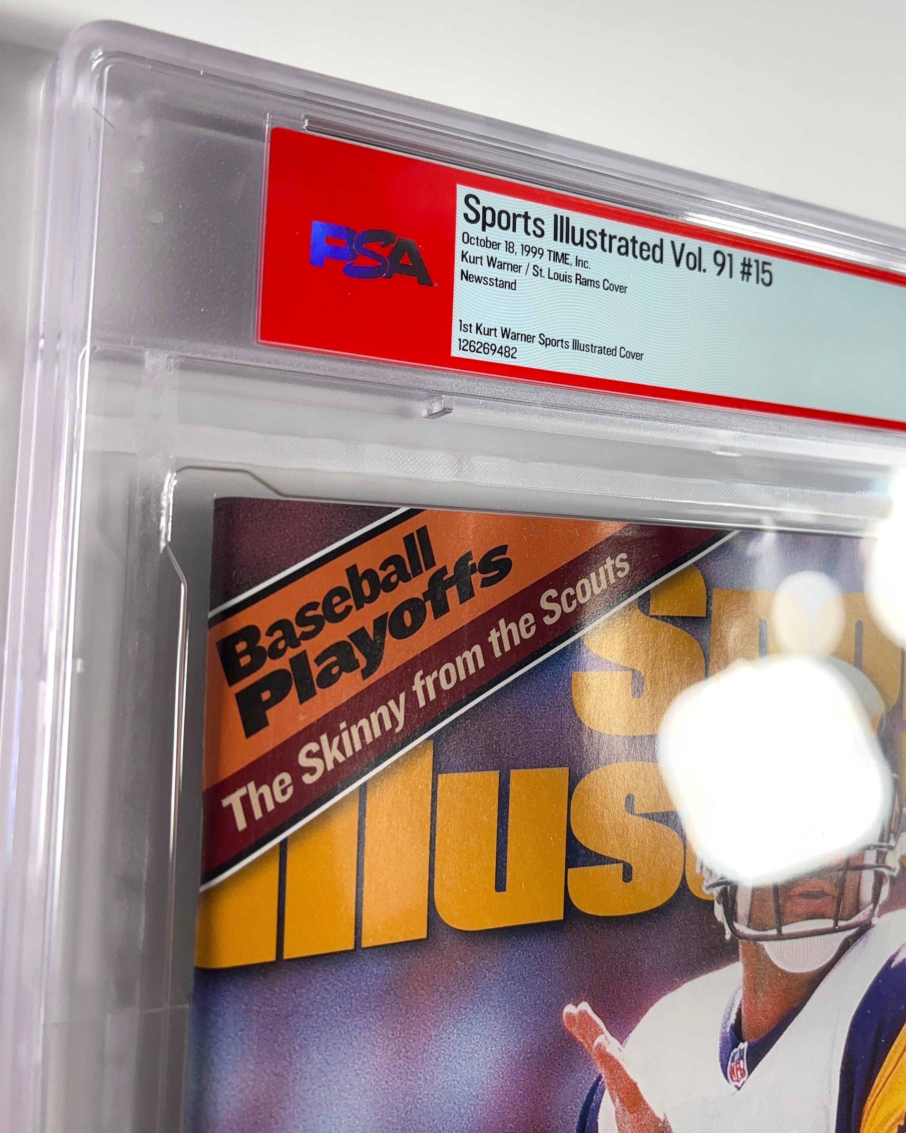
The label is what it is. A white box with a red border isn’t going to win any design awards, but it is recognizable and conveys authority to sports collectors who are unfamiliar with magazine grading. So that’s good.
The label notes are detailed, identifying each magazine as newsstand, subscription, label removed, etc. This is great when you’re looking at one up-close, but it's not as convenient when scanning listings on eBay or elsewhere. CGC’s bold, italicized “Subscription Edition” floating above the notes and below the publication title is easy to spot, even in small photos.
The top labeling, however, is a disaster. It’s maybe half the width of CGC’s top label, with tiny font, and buried beneath plastic that isn’t very clear. Worse, the text faces the wrong direction. (Update: Recent submissions have come back with the text direction corrected, which is great! Unfortunately early-subbed slabs will forever look like the goofy dragon meme in my boxes.)
Because the top label sits in a recessed portion of plastic, my gut tells me the width won’t be increased any time soon.
Speaking of label width, I would really prefer if the label extended the full width of the case.
Comic books are obviously the priority as PSA enters this market, but by using the same size label for magazine slabs, they’re indicating that it wasn’t worth the money to create a separate label for the comparatively small market of magazine collectors. That’s unfortunate, because SI collectors have been very eager to embrace PSA’s entry into the market. Hopefully PSA is willing to make this change once they have a foothold in the market.
Things I Noticed in My Submission That Might Not Affect All PSA Magazine Slabs
It’s not visible in these photos, but a few of my cases have spots of rainbow-like iridescence on the surface. This phenomenon is called “Newton’s Rings”, and it either wasn’t as common on my CGC slabs, or I didn’t notice it as much. My guess is, since the slab well is thinner than CGC’s, this rainbow-like “illusion” will be more common in PSA slabs.
All five magazines in my batch appear to have some waviness at the top and bottom of each issue. None of the grader notes mention this, so I don’t believe the waves were there before grading. I suspect it might be related to the encapsulation process, or the snug fit of some issues. Not ideal!
For now, I’m planning to continue grading with PSA. The app is better, the slabs are better, and the pop report will be better once it’s finally up and running. There’s still some room for fine-tuning, but this is clearly a good start.